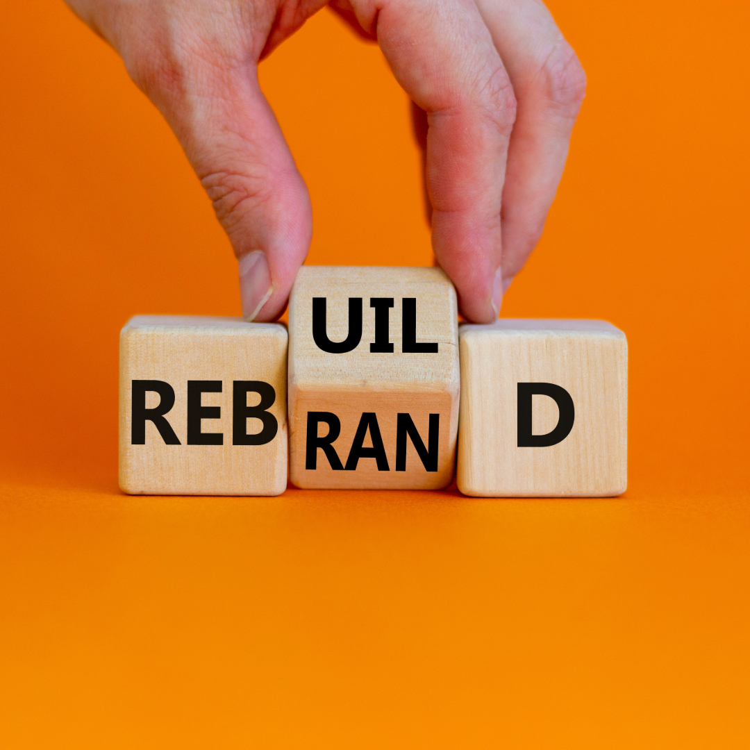
Yahoo! to Rebrand After 30 Days of Logos
Yahoo! to rebrand its logo – it was announced after its 30 days of change campaign. For the next month you can check out a new variation of the Yahoo! logo before the official new logo is revealed on September 4th.
Yahoo! stated that the new logo will be a modern redesign that will better reflect the company’s “reimagined design and new experiences”, but will still uphold the unique characteristics that we all recognize. What won’t change? The classic purple color, iconic exclamation point, and ever famous Yahoo! yodel.
“Over the past year, there’s been a renewed sense of purpose and progress at Yahoo!, and we want everything we do to reflect this spirit of innovation. While the company is rapidly evolving, our logo — the essence of our brand — should too.” explains Kathy Savitt, chief marketing officer of Yahoo!
To this point, several other companies have recently rebranded their logos to have a more modern look and feel. Typically, they incorporate a simplistic logo treatment with a flat design and minimal color scheme, such as Microsoft and eBay. Even Starbucks downsized their logo not that long ago to be more contemporary and iconic.
Do you think Yahoo’s 30 days of change campaign will help spur a renewed interest in the company or be a failed attempt at capturing consumers’ interest?

Linda Fanaras is the CEO and Founder of Millennium Agency located in Manchester, NH and Boston. She can be reached at 877-873-7445 or [email protected].