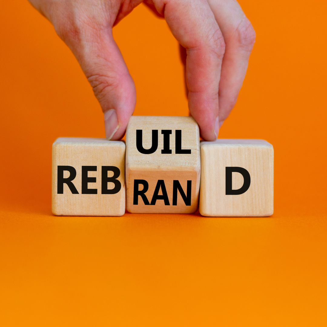
Yahoo! Reveals New Logo After 30 Days Campaign
Yahoo! Reveals New Logo on Tuesday evening after its 30 days of change campaign. For the past month the company has been assuming a different logo each day, all of which were contenders in the final design decision. The campaign sought to generate enthusiasm and engagement around the rebrand, but did it succeed?
The reviews have been mixed from the start of the campaign, but now that the new logo has been revealed the masses are really speaking up. Many are not impressed with the publicity Yahoo! has tried to build around the rebrand and feel the new logo is not worth the buzz. Here’s what we think.
The new logo follows suit with other companies that have rebranded their logos to be more modern and simplistic. These trending logos typically have a flat design, use a minimal color scheme, and select a font that is clear and easy to read. Check out the new Microsoft and Starbucks logos, they follow this trend.
Yahoo! selected a simplistic font different from the wild font previously used. Although the layout and overall design maintains many of the classic Yahoo! logo identifiers like the color and exclamation point, they added something that makes their logo a little unique from all of the other modern logos.
Yahoo!’s new logo utilizes a bevel effect within the letters and exclamation point to add depth and dimension to both versions of the logo, check it out above. “We wanted a logo that stayed true to our roots (whimsical, purple, with an exclamation point) yet embraced the evolution of our products.” stated Kathy Savitt, Yahoo!’s chief marketing officer.
Some seemed disappointed that there wasn’t a greater change in the logo. What do you think about Yahoo’s new logo? Hit or miss? Here’s one thing we know, the masses won’t be as enraged as they were when Gap tried to change their logo.
Image courtesy of Yahoo.

Linda Fanaras is the CEO and Founder of Millennium Agency located in Manchester, NH and Boston. She can be reached at 877-873-7445 or [email protected].