As time goes on, website developers not only deal with changing technology but with changing website designs as well. Years ago, developers focused on skeuomorphism because they thought this was the most creative and innovative technique. Recently, we have seen both flat and material design come into the spotlight. These versions of modern website design offer quicker production techniques and faster load times; however, they have lost some of the creative ability skeuomorphism brought to websites. All of these designs, both new and old, can contribute to a creative website design if chosen correctly. To find the best option for your company, check out these three popular website designs and see if you can determine which one is best for you.
Skeuomorphism
For years, skeuomorphic design has given the user something they want in a website: the feeling of being at home. This theme gives elements within a webpage a more realistic look, allowing the user to feel like they are in an actual scene as the elements appear in a 3-D view. This realistic view is critical for the layout, as the objects appear to the user just as their material, shape, and function would in real life. Unfortunately, due to the newer trends mentioned earlier, skeuomorphism is now becoming less relevant, and developers are moving towards cleaner, more modern design elements.
Pros:
- It allows the user to feel a connection with the website as the objects appear familiar.
- The designer has the ability to trigger emotions by creating scenes within the web page.
- It gives the developer more creative options to express the company’s brand.
- It gives the appearance that the user can “click” on the objects, increasing the UX.
Cons:
- Too many design elements can confuse the user.
- A strong focus on design takes away from the actual content.
- Heavy design elements can lead to longer load times.
- Incorrect use of shadows and textures can alter the actual appearance of the product.
Flat Design
Unlike skeuomorphism, flat design brings a new, simple, and elegant template to the world. For developers, it is considered a more clean-cut and simplistic approach to websites. Flat design utilizes the 2-D interface options while allowing some room for creativity by developers. It focuses more on functionality than on the visual display by appearing on a completely flat surface. This becomes more beneficial for users as there are no flashy elements to confuse them while they navigate the website. This clean-cut appearance allows any company to look professional and welcoming. Although there is a lot of support for this clean-cut look, there are still some designers who miss the creative flexibility that skeuomorphism provides.
Pros:
- The lack of intricate design elements allows the site to function on several devices.
- Eliminates unnecessary elements to create a more simplistic design.
- Allows the user to quickly go through content.
- Allows for quick load times, as there is a lack of intricate designs.
Cons:
- Limited design options regarding color, shapes, and icon designs
- No shadows or shading on icons can confuse the user due to a lack of guidance.
- Can create a generic-looking site, preventing your brand from standing out.
- Lack of contrast and design has the possibility of boring users.
Material Design
Compared to flat design, material design provides the user with the opportunity to explore many different areas in a new and interactive way. With the use of the z-axis, material design brings back some elements of skeuomorphism, which allows for objects to appear in a three-dimensional way. Material design may not come with load times as fast as flat design, but it does provide developers with more color and layout options. Due to the use of the z-axis, it has the ability to guide the user through the webpage. With the illusion of one object floating over another, it is clear what buttons are clickable and where the user should go next. Although it can take longer to implement the theme, it makes the interaction with the UI feel real to the user, which, in the long run, can be beneficial for your business.
Pros:
- Comes with a set of detailed descriptions and leaves little room for guess work.
- Sites becomes easier to navigate with the use of the z-axis.
- Websites have the ability to perform across platforms.
- Provides built-in animations, eliminating the need to manually manage them.
Cons:
- Has the potential to drain users’ batteries due to the large number of animations.
- It is connected to Google, which may limit your uniqueness.
- Changing guidelines may be hard for some to keep up with.
- It takes longer to implement than a flat design.
With all of these different design options, the one thing to keep in mind is: who are you trying to reach? Would your users prefer something clean and simple or more exciting and interactive? Once you know the answers to these questions, you can pick a website design that fits you. The important concept to always remember is that no matter how professional or artistic your website may look, make sure your users understand it.
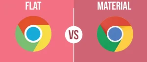
Image Credit: Medium
Being able to provide your customers with a user-friendly website that also allows them to interact and not get bored will be beneficial for your company, as they will spend more time searching. More time spent searching is beneficial for your company, as this has the potential to lead to large conversion rates.
To learn more about different web designs and how the proper one can help your business, contact us today for a free consultation.

