How to Design a Perfect and Timeless Logo for Your New Business
If you are in the process of designing a logo for your business make, sure you set aside enough time to give it the attention it deserves. Many entrepreneurs rush the design process and simply choose a design they personally like. Of course, you have to love your logo, after all it’s your business. However, your logo is the foundation for your entire brand. Make sure it doesn’t just speak to you but that it resonates with your core demographic. Here are some tips and guidelines on how to create a perfect and timeless logo for your business.
Start with the Right Color Palette
One of your first considerations when it comes to logo design should be color choice. Don’t simply go with your favourite color or copy a pretty color pattern you found in a competitor’s logo. Different colors convey different meanings. For example, orange stands for vitality, playfulness and friendliness while dark blue is interpreted as trustworthy and mature. It’s no surprise businesses in the finance industry often opt for a blue color palette. Be sure to go with a core color that captures what your business stands for.
Consider the Meaning of Fonts
The font(s) you use for your business name and slogan also requires careful consideration. Different typefaces communicate different meanings. For example, Serif fonts are often looked at as sophisticated and formal where Slab Serif is interpreted as bold and trendy. Choose your font or font pairing based on what most accurately reflects your business’s values.
Find the Right Graphic and Layout
Once you have narrowed down your color and font preferences it’s time to have some fun. Use a free tool like the GraphicSprings Logo Maker to see what your logo would look like with different graphics. If you are creative you can hand draw different ideas or use a program like Illustrator. If you aren’t the do-it-yourself type or don’t have a creative background you can hire a professional designer of course. Ask to see different concepts showcasing different graphics and layouts so you can see which option works the best.
Make Sure Your Logo Stands the Test of Time
Designing a logo that looks pretty is only half the battle. As you follow the tips above there are some logo design principles you should keep in mind to make sure your logo ages well and looks professional at the same time.
Keep it Simple
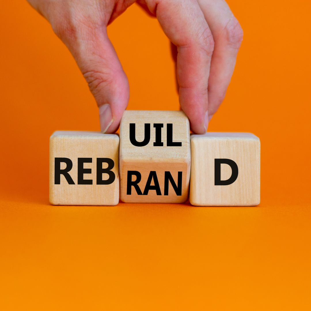
One of the key differences between Fortune 500 company branding and small businesses is the complexity of the logo. Meaning small businesses often go the route of complicated graphics with lots of detail and literal interpretation of the product or service the business offers. Larger corporations typically go for abstract shapes that are clean and simple. Try to keep your design as simple as possible. A simple design is more memorable and lends itself better to building a recognizable brand. In addition, try to avoid effects and any trendy design techniques. These can date your logo quickly, which may require you to undergo an expensive rebrand a few years down the line.
Limit Colors
In line with keeping things simple you should also try to avoid using too many colors. Of course it’s exciting to add multiple colors as it can result in beautiful art work. However, your design can quickly get too busy. Something else to keep in mind is to avoid using heavy gradients. Of course, there are exceptions to any of the tips shared in this article but sticking to them will guide you in the right direction.
Make Sure Your Logo Scales
Before you finalize your logo make sure it scales. It might look beautiful on your tablet or laptop, but what happens once dimensions and scale come into play? One day you may want to put your logo on a large billboard or banner at a tradeshow or use it in a traditional newspaper ad. To make sure it looks professional in those circumstances test the scalability of your logo by increasing and decreasing the size to the extremes but don’t stop there! As you scale your logo, also try it out in just black and white. There are instances in print and web where you are limited to black and white. It’s good practice to make sure your grey scale logo looks just as good as your color version.
Before You Go…
The tips and design principles outlined here are simply a guide. You want to inject your personality and business values into your branding. If that means breaking some of these rules that’s fine of course. If you don’t have a design background and want to play it safe make sure to revisit this article when you’re ready to design your business logo.
About Millennium Agency
Millennium Agency is a national, award-winning, digital, creative, content/PR, and video marketing firm. With offices in Boston and New Hampshire, our team unites creative branding and data analytics to accelerate our clients’ growth, while combining our clients’ vision with our marketing expertise to increase sales opportunities and drive brand success. From video advertising and web design to social media and PR, Millennium can guide your marketing efforts every step of the way. Contact the professionals at Millennium Agency to learn more!

Linda Fanaras is the CEO and Founder of Millennium Agency located in Manchester, NH and Boston. She can be reached at 877-873-7445 or [email protected].