Mastering UX Design: Designing Websites with the User in Mind
Designing a dynamic website that offers a user experience that cannot be forgotten requires careful planning and optimization. Whether this is your initial website design or a website rebrand, you should always design with the user in mind. What will be most appealing? What information should be displayed on the home page? What type of navigation tools should be used? These are all important questions that you should be able to answer using data and previous experience. With that being said, here are our top tips for designing with the user experience in mind.
Use Data to Drive Design
Utilizing data from past and present branding and marketing campaigns allows you to make educated decisions regarding your website design. Data can drive your design efforts by allowing you to uncover what customers are looking for. Are they more direct? Then design a website that gets straight to the point. Do they prefer a brand story to get acquainted with your products? Then harness immersive scrolling to tell that story. Consulting the data you have access to will help you craft your website with the user experience in mind, resulting in a more user-friendly and effective end product.
Immersive Scrolling
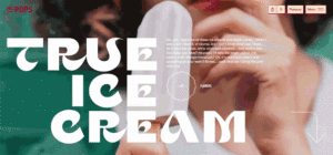
Similar to webpage animations and micro-interactions, immersive scrolling is a popular website design strategy that allows you to tell your brand story using visuals and words, often moving through the “story” as viewers scroll through the page. A great example of powerful immersive scrolling can be seen on the Mr. Pops website. In their story, they highlight what they do, their mission statement, customer reviews, and a photo gallery at the bottom.

Immersive Scrolling example by Mr. Pops from Codeart’s Article
Immersive scrolling is an excellent way to get viewers who are eager to get to the bottom of the story you are telling to spend more time on your website. Not only that, but the visual appeal results in a dynamic website that catches the eye and draws users in – ultimately boosting the user experience.
Keep Things Minimalistic
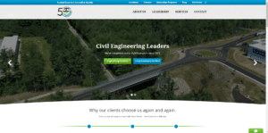
The concept of minimalism has evolved as marketing preferences become more and more extravagant and detail-oriented, but there is still a time and a place for it on your website. Minimalist websites should be function-oriented, with nondisruptive negative space, flat elements, and easy navigation. Minimalist websites should also keep in mind what colors they are using, with monochromatic color schemes working the best. A strong minimalistic website can be seen for Hoyle Tanner, a well-known civil engineering firm. The design pictured below features a simple color palette of green, blue, white, and black, giving it a clean and fresh look and feel.

Minimalist Website example by Hoyle Tanner
Their homepage is easy to navigate, with quick direct buttons in place for their most popular services, followed up by a breakdown of why their clients choose them. At the top, they have placed easily readable tabs to select exactly what information the user is looking for. This minimalist design highlights the main points of the company without overwhelming users with too many images and information which cultivates a positive user experience.
Emotional Components
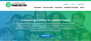
Humans base their decisions on emotions most of the time, rather than logic. This means that having an emotionally impactful website can drive traffic and lead to conversions more often than just pictures and information. Connected Families New Hampshire is a support initiative for children and families experiencing mental health challenges in the state of New Hampshire. Their website deals with highly sensitive users and needed to be emotionally appealing to all.

Emotional Appeal example by Connected Families NH
The first line that jumps out at users is “Connecting Families To a Better Future.” This instantly touches on the emotions of viewers, prompting them to think about their own family’s future. Additionally, its main theme is the fact that they are there to help, being a family-driven support system. This is instantly appealing to website visitors, especially those who are currently looking for some sort of help for their family. An experienced web designer will know how to take your brand’s mission and values, and design an emotionally impactful website that acknowledges the user experience.
Consult a Professional
Staying up –to-date on current website design trends is an excellent way to know whether your website is appealing to current users or not. But a professional web designer will be able to translate those trends, along with your goals, into a website that stands out and drives traffic. Web designers have the knowledge and expertise to ensure SEO optimization and a successful user experience, allowing you to sit back and focus on other areas of your brand. Millennium Agency offers eye-catching, conversion-driven website design services that are sure to excite your users. In fact, the Hoyle Tanner and Connected Families NH websites are the product of Millennium Agency’s work! Like what you see? Schedule a call with our team.
About Millennium Agency
Millennium Agency is a nationally recognized, top woman led B2B branding, positioning, and digital marketing firm who creates value that builds emotionally impactful brands that influences your customer’s buying decision, giving you the competitive advantage. As your industry partner for B2B pharma/biotech, technology and manufacturing, our proprietary research-based framework makes a strong impact and accelerates your brand growth. While you focus on what you do best – running your business successfully – our team will build your brand, and drive leads. For more information, call 877-873-7445 or schedule time here.

Linda Fanaras is the CEO and Founder of Millennium Agency located in Manchester, NH and Boston. She can be reached at 877-873-7445 or [email protected].


