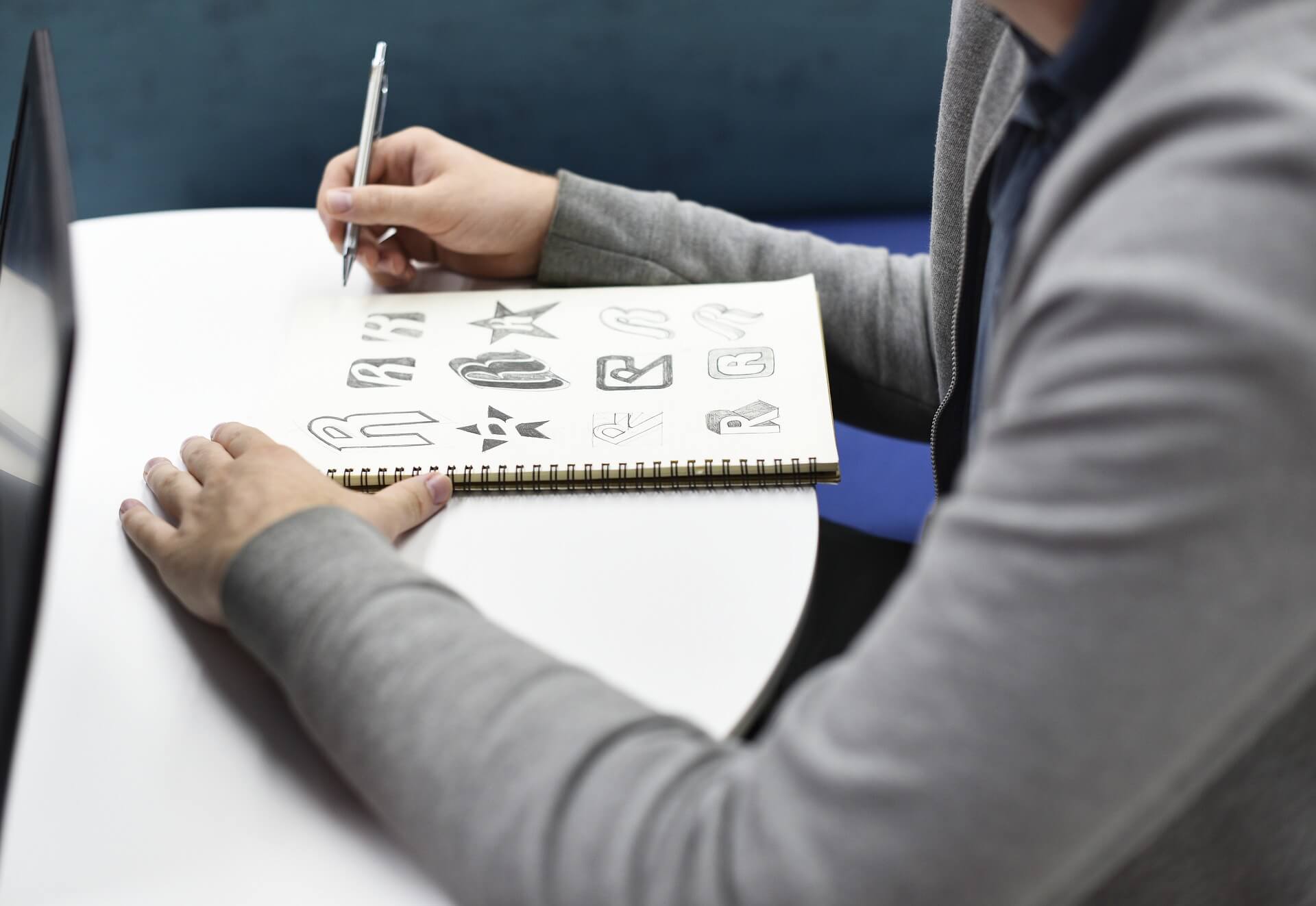
Logos. They are the first point of contact between your business and a prospective customer. Some logos are stylish and extravagant while others are simple and subtle, but they all serve the same basic functions. A successful logo will catch the eye of a consumer, inform them in the most basic way about who you are, and instill recognition and familiarity in their memory so as to encourage repeat business. If your business is in need of a logo, or your current logo needs a refresh, here are five principles to help you design your logo:
Color and Shape
Certain colors can incite certain human emotional reactions: red is considered an inciteful color while blue is often considered soothing. Knowing your colors and the psychological effects they may have on consumers is a great starting point for logo construction. Shape also has an effect on human emotions as well. Did you know that the strongest shape found in nature is the triangle? For this reason, many people subconsciously associate this shape with strength and sturdiness. Small details like this can lead to the creation of an effective logo. Make sure you study the effects of colors and shapes on consumers before you roll out your logo.
Know What’s Already Out There
When designing your logo, be cautious of copying an existing one. Try to avoid similar traits to other logos. You don’t want customers to mistake you for, or associate you with, a completely different business, especially if they’ve had a negative experience with that business.
Don’t Limit Yourself
Many businesses utilize acronyms or a full spelling of their business name and then call it a day, but it doesn’t have to stop there. It’s important to be creative and think about things from a different angle than the competition when designing your logo. For example, the arrow under the Amazon logo not only forms a smile but it also points from A to Z, reflecting the nature of their business. These small features differentiate Amazon’s logo from the logos of their competitors and offer a creative way of connecting with their customer base.
Keep it Simple
An overly extravagant or eccentric logo can be a lot to take in for today’s society. People think fast, talk fast, and most importantly look fast. You don’t want your logo to be overlooked because it was too much for a passing glance to take in. Many people are bombarded by symbols and signs on a daily basis. You want to make sure that your logo stands out but is also easy to understand. It is this philosophy that drove Millennium Agency to shorten its title with our Short is Sexy campaign.
Know Your Customers
The jagged bright green letter M tearing through a black Monster can is quite reflective of the energetic nature of the product and its customer base. On the other hand, Teavana’s logo features a zen pose that reflects the calm nature of their product as well as tea culture in general. Make sure you know who your customer base is and what their values are, then try to align your logo’s design with these values.
Remember, a well-designed logo can increase lead generation to your business while a poorly designed one may actually drive away customers who are in need of your products or services. If a new and exciting logo is something you are interested in for your business, contact Linda Fanaras, President/Strategist of Millennium Agency www.mill.agency.
About Millennium Agency
Millennium Agency is a nationally recognized, top woman led B2B branding, positioning, and digital marketing firm who knows how to create value that emotionally influences your customer’s buying decision, giving you the competitive advantage. As your trusted partner in B2B software technology and manufacturing, we provide the branding and positioning framework that make an impact – so you can focus on what you do best – run your business successfully. With offices in Boston and New Hampshire, and a worldwide presence, the professionals at Millennium Agency would like to learn more about your business. Visit www.mill.agency or book time here.